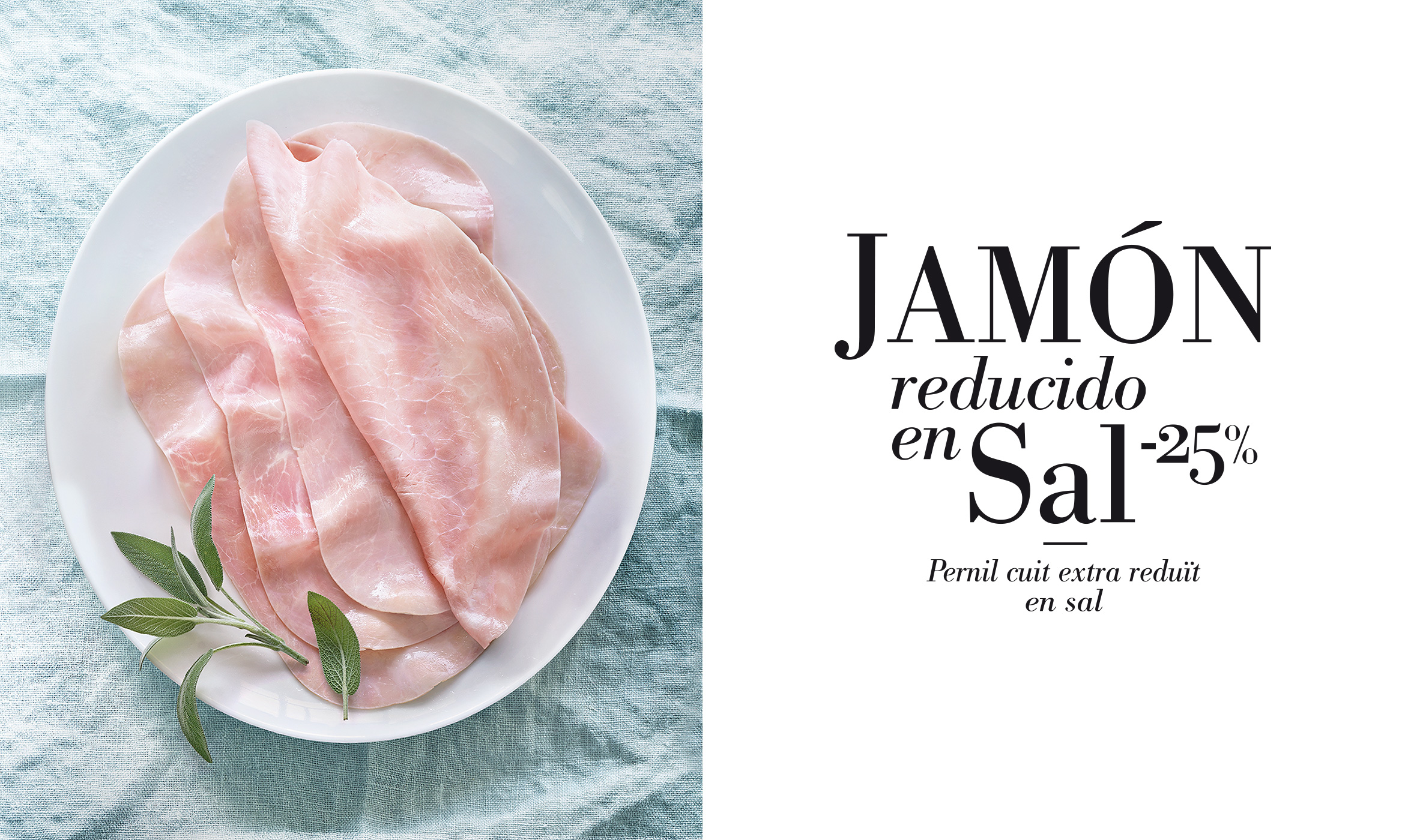
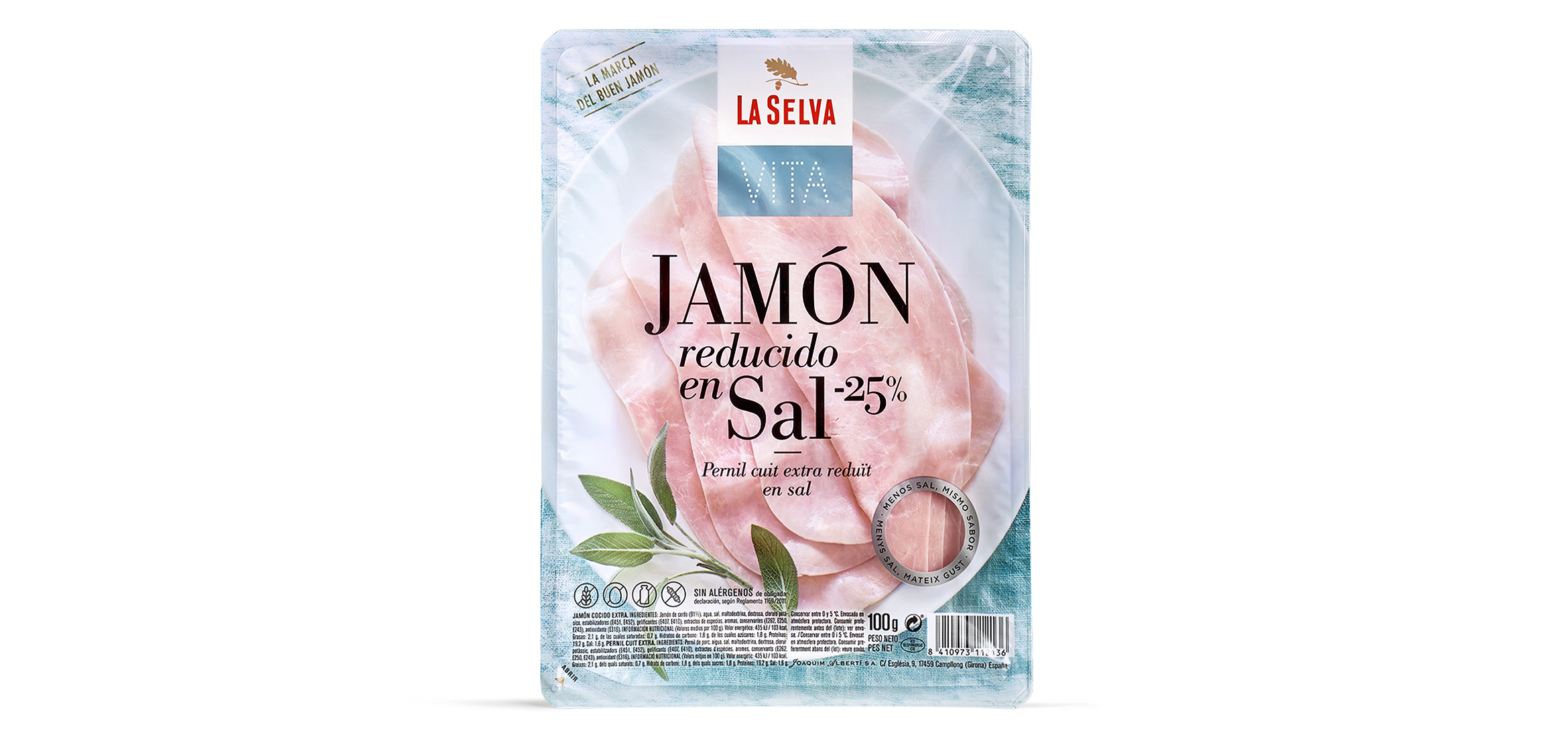
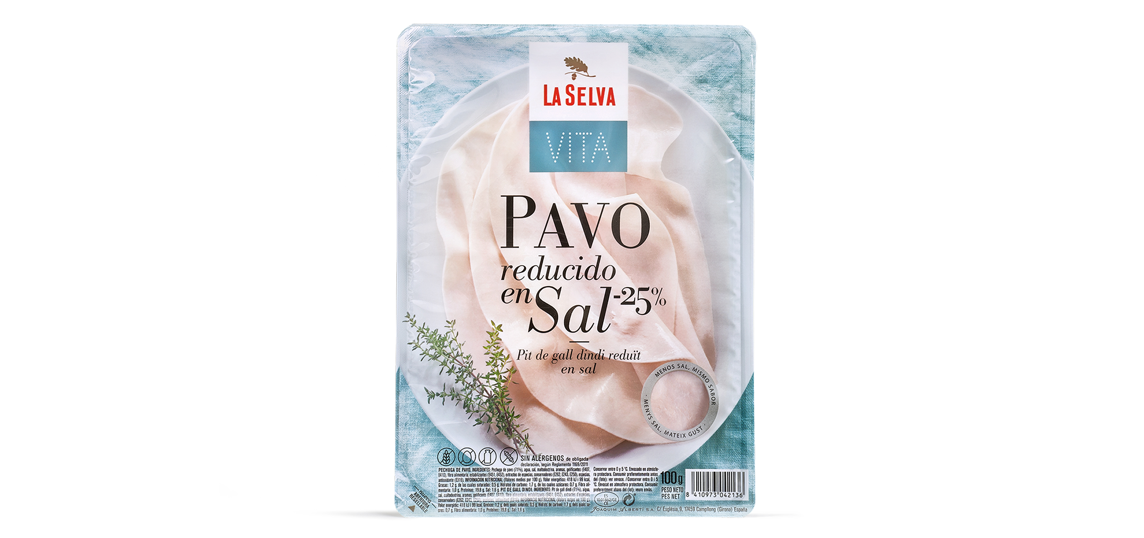
On packaging for healthy products, one of the great challenges is to show that the benefit obtained is not achieved at the cost of sacrificing flavour. Eva Estudi was responsible for the naming, tone and packaging design of this range of cooked meat products both for the charcuterie counter and self-service shelves. The approach clearly shows the benefits of the product. In fact, the main benefit forms part of the name, although this does not prevent us using an attractive product photo to demonstrate that there are no concessions on flavour and that it is a tasty product as well as a healthy one. Other details, like the oval plate, chosen to match the shape of the ham and the packaging, and the small window on the front of the pack to show the colour and texture of the product, help make the communication on the packaging clear and stylish. This project shows that coherence between products in the same range can be maintained even in different channels and displays.
With La Selva Vita, the brand has begun to move towards developing sub-brands focusing on consumer needs and positioned as innovative as well as quality charcuterie lines.

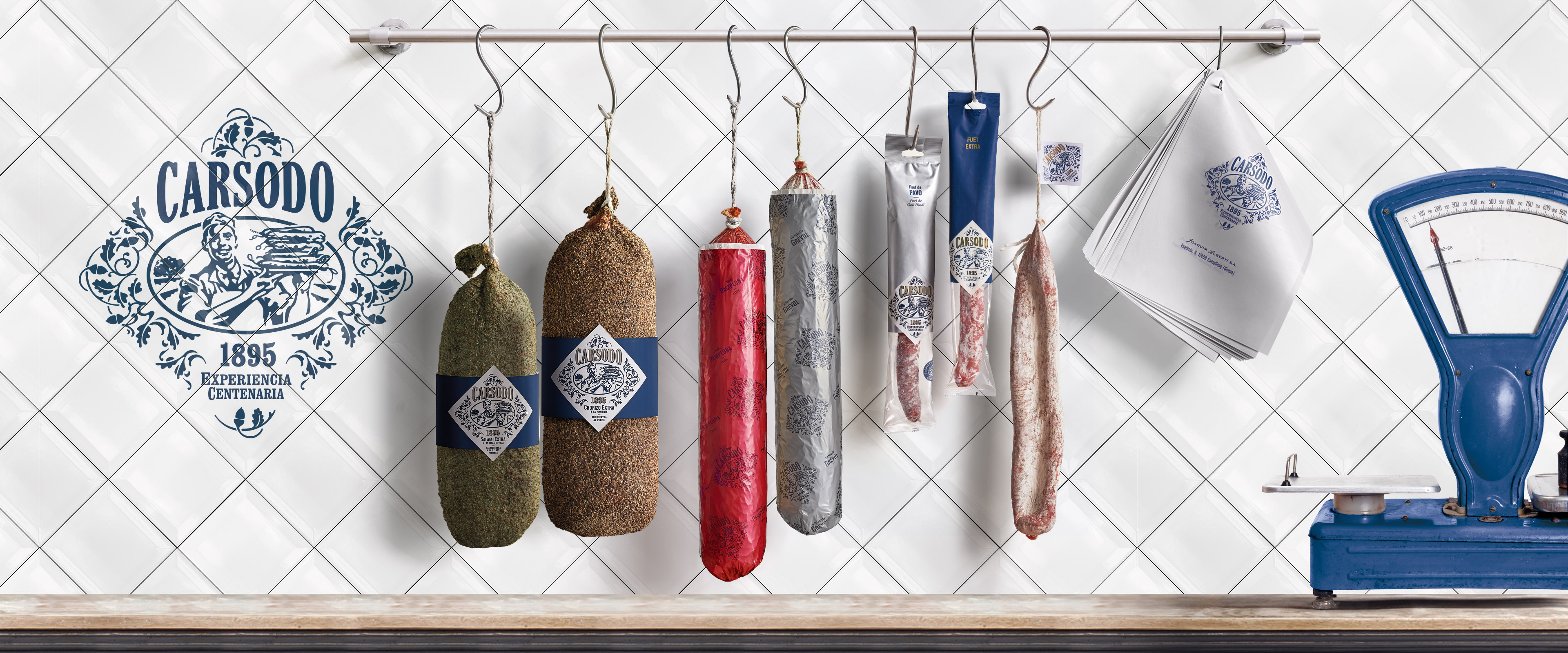
Carsodo
Carsodo, celebrating nostalgia
This is a brand of cured meat founded in 1895 in Bescanó, a small town of Girona. The purpose of this redesign was to highlight the company's expertise and create an own identity for the brand. Origin and nostalgia. On these two pillars we built the new image of the brand.