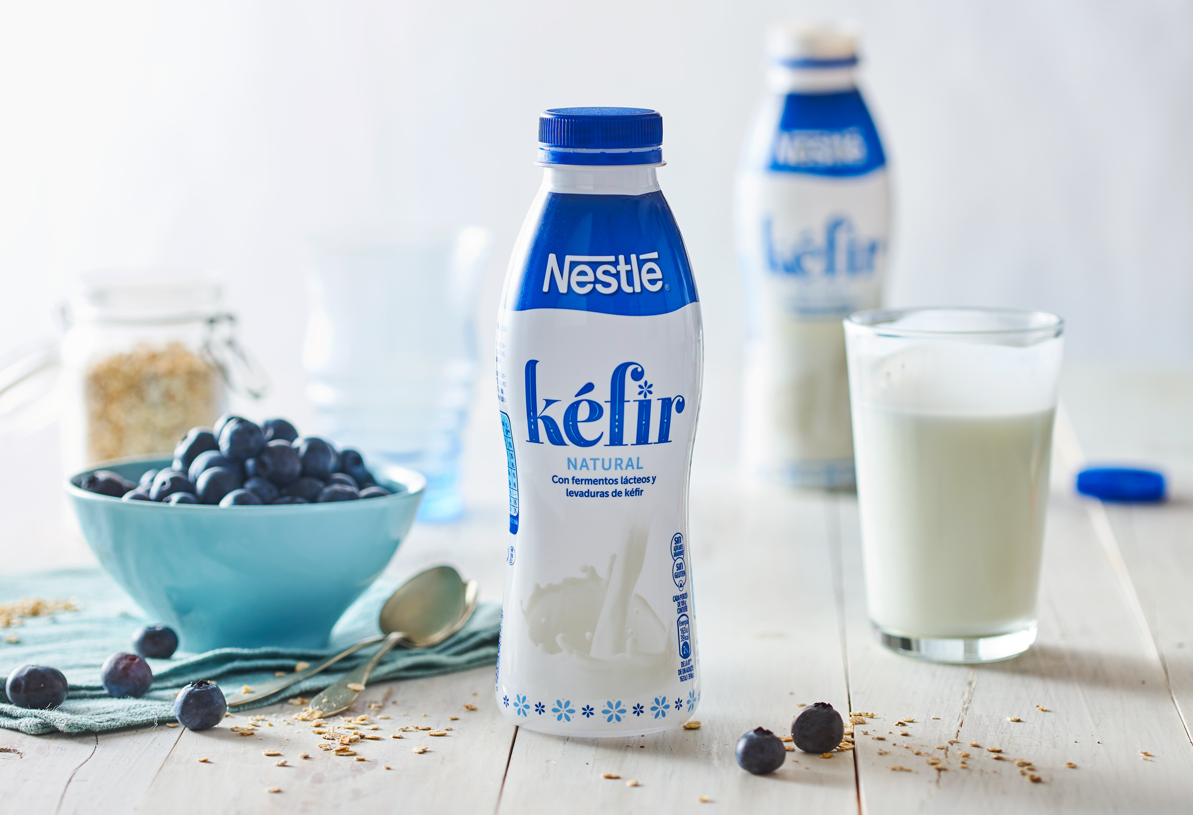
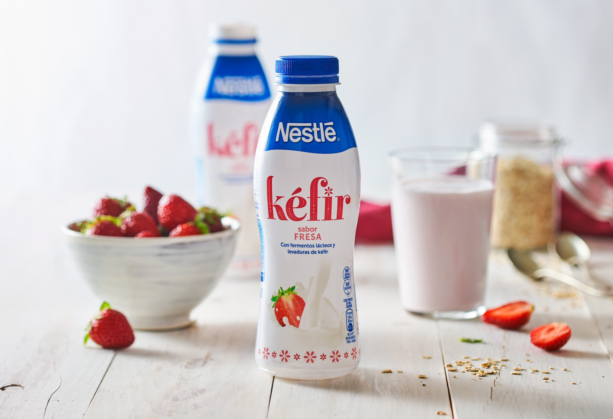
In line with new food trends, Lactalis Nestlé is offering the market a range of kefir, initially with two flavours: natural and strawberry. Consumers of this product are looking for alternative foods to yoghurt that offer a different flavour while remaining authentic and healthy. For Eva Estudi, the challenge is to create a relevant, credible language under the Nestlé brand for a more alternative, traditional product than most of the existing ones under the brand.
As the product is originally Bulgarian, we thought its packaging should be developed like a traditional container, not in an obvious way through the structural design but rather in the branding and graphics. For this reason, we took the decoration used in popular ceramics and textiles in Bulgarian culture as the basis to develop a decorated typeface for the sub-brand, together with a series of details giving the product a young, authentic image without gimmicks.
The image created for Lactalis Nestlé in this case shows, once again, that when a brand picks up traditional and artistic elements, they not only fill it with value, it also becomes a vehicle to make them last.
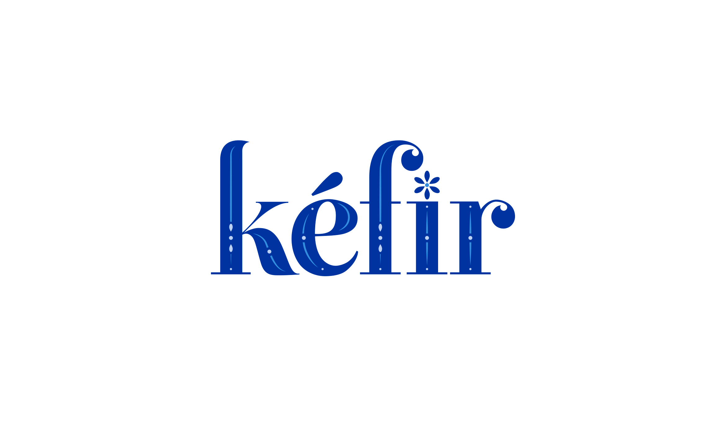
We developed a decorated typeface for the sub-brand, together with a series of details giving the product a young, authentic image without gimmicks.
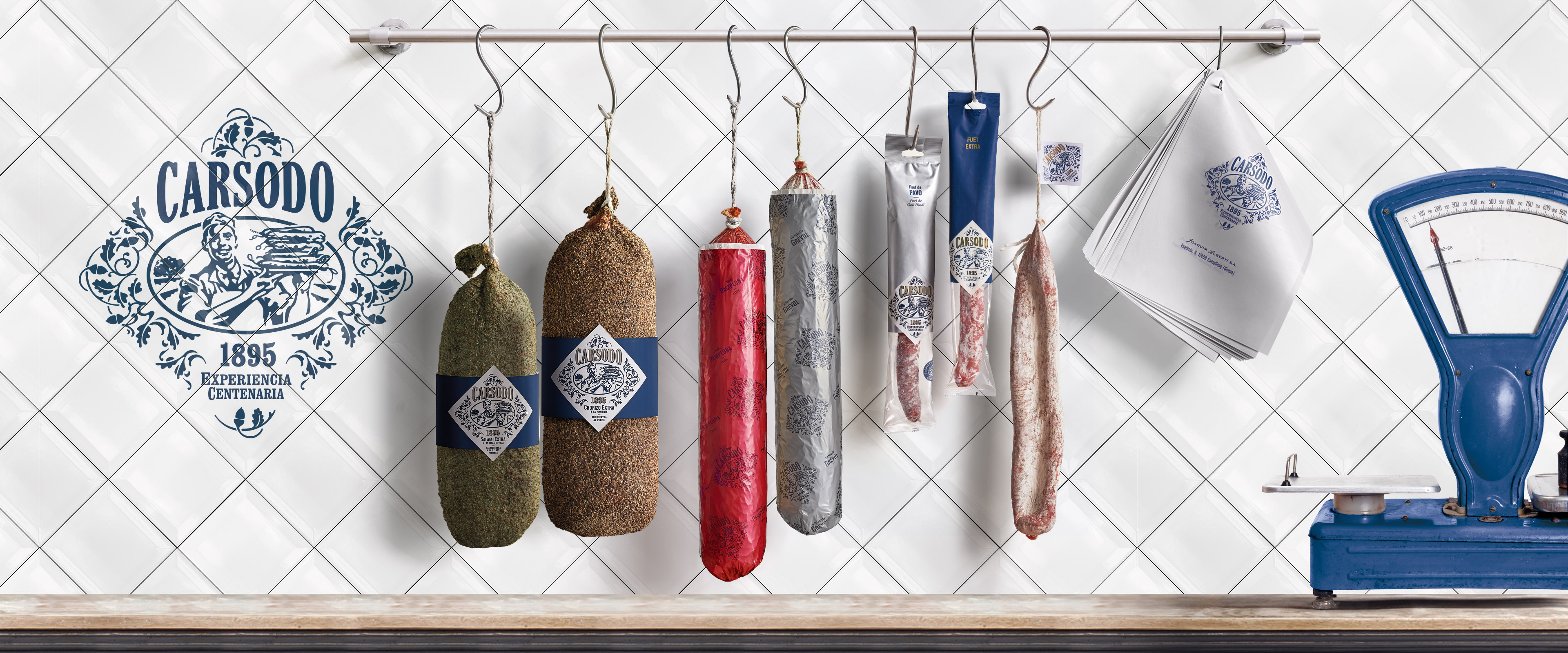
Carsodo
Carsodo, celebrating nostalgia
This is a brand of cured meat founded in 1895 in Bescanó, a small town of Girona. The purpose of this redesign was to highlight the company's expertise and create an own identity for the brand. Origin and nostalgia. On these two pillars we built the new image of the brand.